Jake's Take: SU's Athletics Logo
SU Athletics Unveils Logo Identity
Many individuals have asked about the process followed in creating the new graphic identity for Syracuse University’s athletic teams. It all began in the summer of 2002 when Nike Team Sports, one of the world’s most accomplished marketing and design companies, approached SU to help us contend with a longstanding concern—how best to represent all of our 21 teams in a manner that would be consistent, readily recognizable and aesthetically pleasing while maintaining the integrity of the institution’s identity.
Each university has its own traditions and values, and each generation of fans has its own connection to an institution’s athletic program. It is critical to understand and embrace this before moving forward with an identity redesign. The objective must be to design a graphic identity that reflects no mere trend or fad, but instead is strong and able to withstand the test of time.
The first part of the process involved developing a clear understanding of Syracuse University’s identity—its history, mission and vision—and analyzing the athletic program’s existing identity package. This research stage was the most vital aspect of the process in assuring that Nike understood what exactly is Syracuse University.
We felt extremely fortunate to have this opportunity, as one of only a small select group of universities in the country to work with Nike Team Sports on a redesign effort. Nike devoted significant time, energy and expertise in researching SU’s athletic background and fans. Nike staff spent months poring over old photographs and documents in the University archives, and conducting interviews with numerous alumni and other fans, people on campus, coaches and retailers. They established a graphic direction that merged the modern architectural elements of the campus with the rich tradition of the city and the University. The slogan “Respect the Past—Represent the Future” was developed to brand our athletic program.
In its research, Nike noted that our individual sports teams were using their own ID marks and color combinations with little or no connection to an overall branding system. Nike recommended to a University steering committee that the following be developed: a consistent/refined color palette; a custom logotype trademark; and a new primary identity to be used in all SU athletic programs, communications and products.
Nike determined that we had so much athletic history and rich tradition, combined with a striking primary color and immediate name recognition—with both “SU” and “Orange”—that a complete remake of our athletic identity would be neither necessary nor desirable. Nike presented its preliminary report of findings and recommendations, along with three different design prototypes, to the steering committee (with representation from the University’s Athletics, Alumni Relations, Bookstore and Auxiliary Services departments, and student body). Then we spent many months going back and forth with refinements.
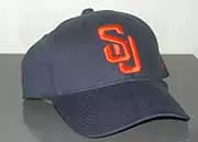
Nike’s research clearly identified that the vast majority of students, alumni, employees and community members referred to Syracuse University as “SU.” Thus, the design of the interlocking “SU” logo, created with a more aggressive, angular aesthetic look but still retaining a true collegiate feel.
Another strong consideration involved the distinctiveness of being “The Orange.” According to the National Directory of College Athletics published by the National Association of Collegiate Directors of Athletics, SU is the only Division I institution in the country to have orange as its sole official color. And SU is the only collegiate or professional sports organization with the nickname of “The Orange”—a distinction dating back to 1890, when both the moniker and the color were adopted by the alumni, faculty and student body.
So the decision to henceforth be known collectively as the Orange in lieu of Orangemen and Orangewomen is not one of political correctness or “messing with tradition.” Rather it is a return to tradition. And a commonality of spirit. In this sense, Orange is not a color, not a fruit. It is a community of fans, student-athletes and coaches united in one following, one affection. It is who we are, whether we’re proudly wearing orange and chanting “Let’s Go, Orange” in the Carrier Dome or elsewhere. We’re Orange together.
As Chris McClure, creative director for Nike Team Sports, stated very eloquently, the purpose of our work with Nike was “to create a very clean, refined and unique identity that by design fuses elements of the past with the aesthetic values of the future. We want to respect the past and represent the future.” I feel we have accomplished this. We are now able to draw all of our teams under one banner with one very powerful identity.
My sole regret in the process is with the timing of our announcement. Our intention was to have a coordinated announcement weeks later, to allow better opportunity to inform our alumni, students and other many fans. The accelerated timetable was predicated by media reports that broke the news. Team uniforms will not be ready for quite some time. We are just beginning to integrate the new graphic identity into our athletic operation. And much of the apparel and hard goods with the new “SU” and “Orange” marks is not yet available. While merchandising is not a driving force behind our efforts—yes, it is one reason for Nike’s involvement, but not for the SU Athletic Department, which receives no money from merchandise sales or licensing—still it is unfair to tease fans with images that are not yet part of the marketplace. I am assured that this will be rectified soon.
More important to me than the merchandise is the appearance of our teams. In the long history of our program, SU has never had one strong, unified logo. We’ve had up to 20 different logos on our athletic apparel. There has been no consistency. Now we do, with our new graphic identity program, and with the striking interlocking “SU” and an emphasis on orange in our uniforms. I believe the bright orange “SU” on a dark blue or white background will be as readily recognizable and distinctive as the Michigan maize “M” on blue, or the white Oklahoma “OU” on red, or the “UCLA” blue and gold combination.
It would be a tremendous compliment to our student-athletes—past, present and future—and to all those who cheer them on.
Sincerely,
Jake Crouthamel
Director of Athletics